Case Study | Paypal and Payme
Case Study - Paypal and Payme
Self-Initiative Research
Last Updated: Nov 12, 2025
PayPal vs. PayMe: Digital Payment Solutions for Hong Kong Users
How Design Fuels Business Goals and Boosts User Engagement?
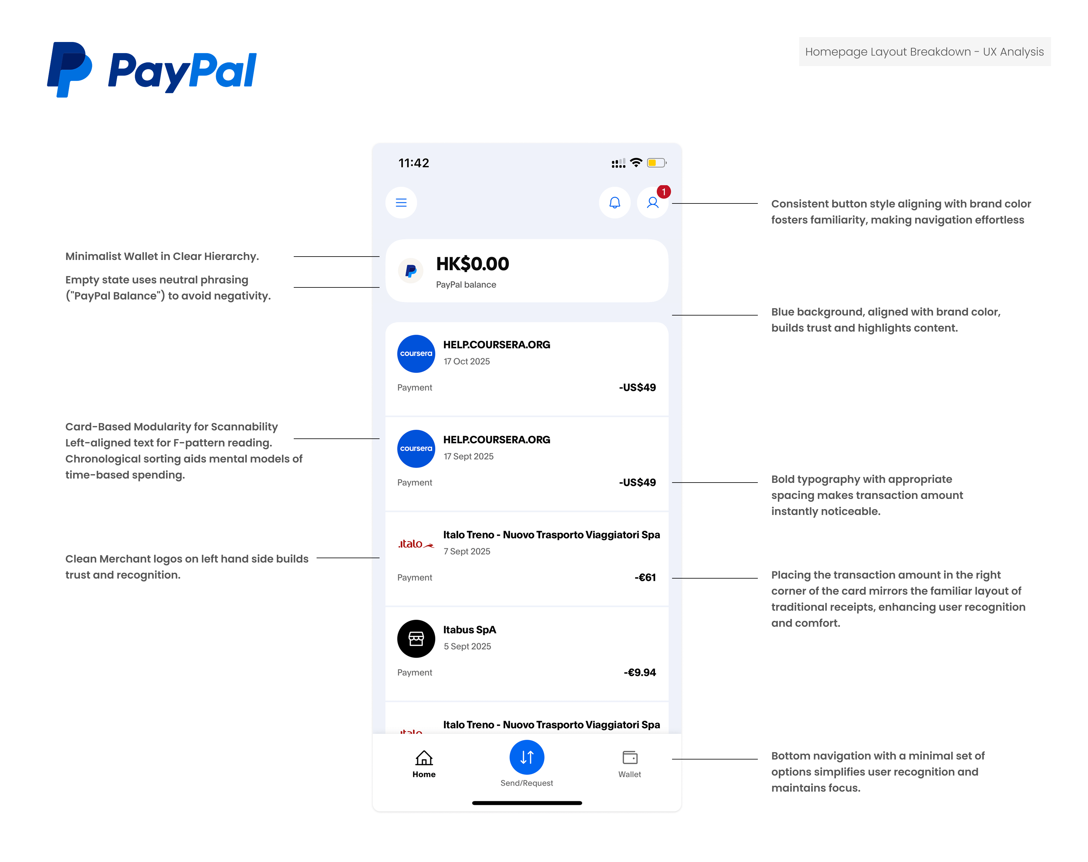
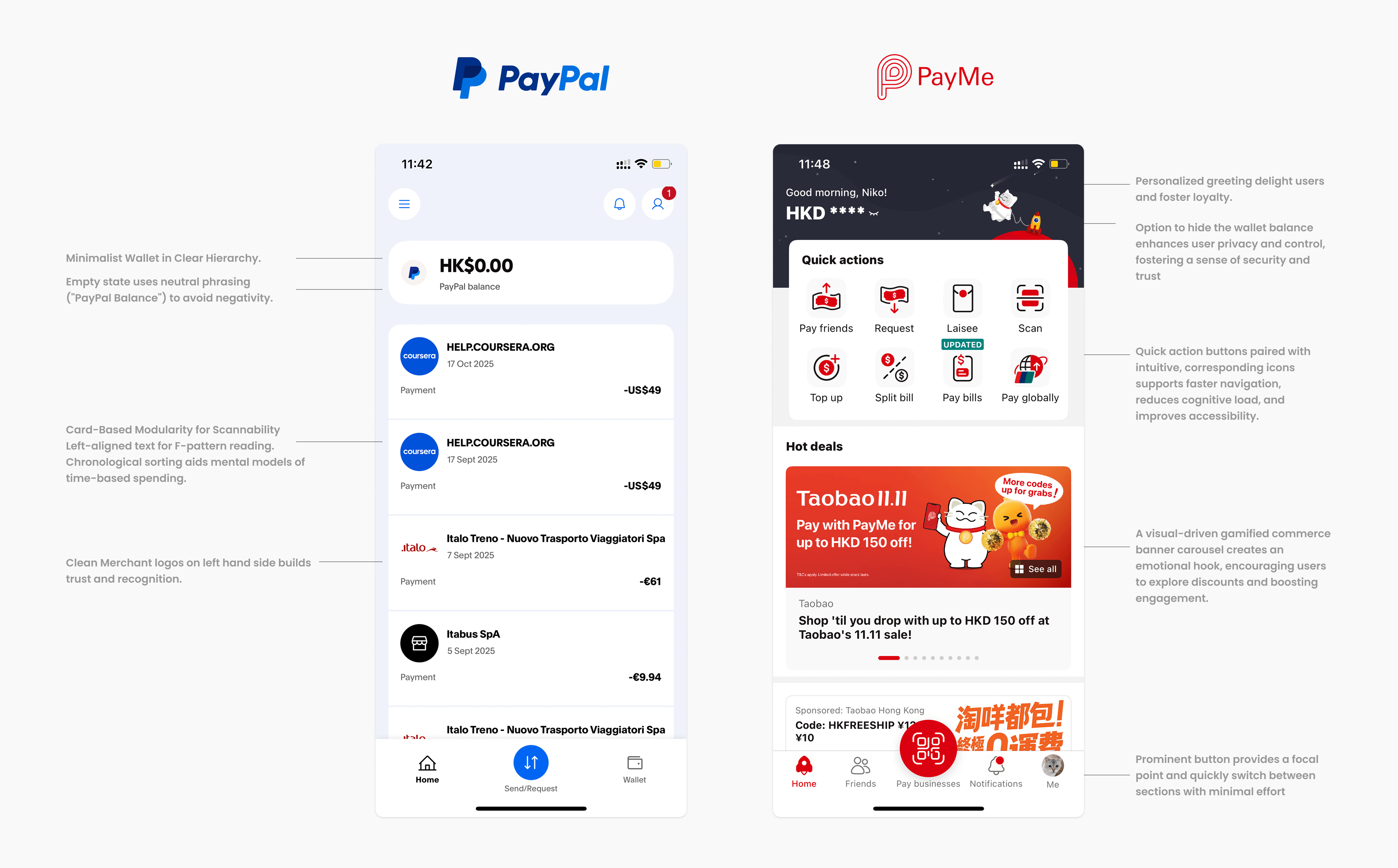
PayPal’s interface adopts a minimalist, card-based design rooted in Material Design principles, delivering a clean and intuitive user experience.
By prioritizing clear information hierarchy and seamless gestural navigation, PayPal ensures effortless financial management. Its focus on transparency builds user trust, creating a streamlined, accessible platform that balances functionality with simplicity, minimizing cognitive load while empowering users to manage transactions with confidence.
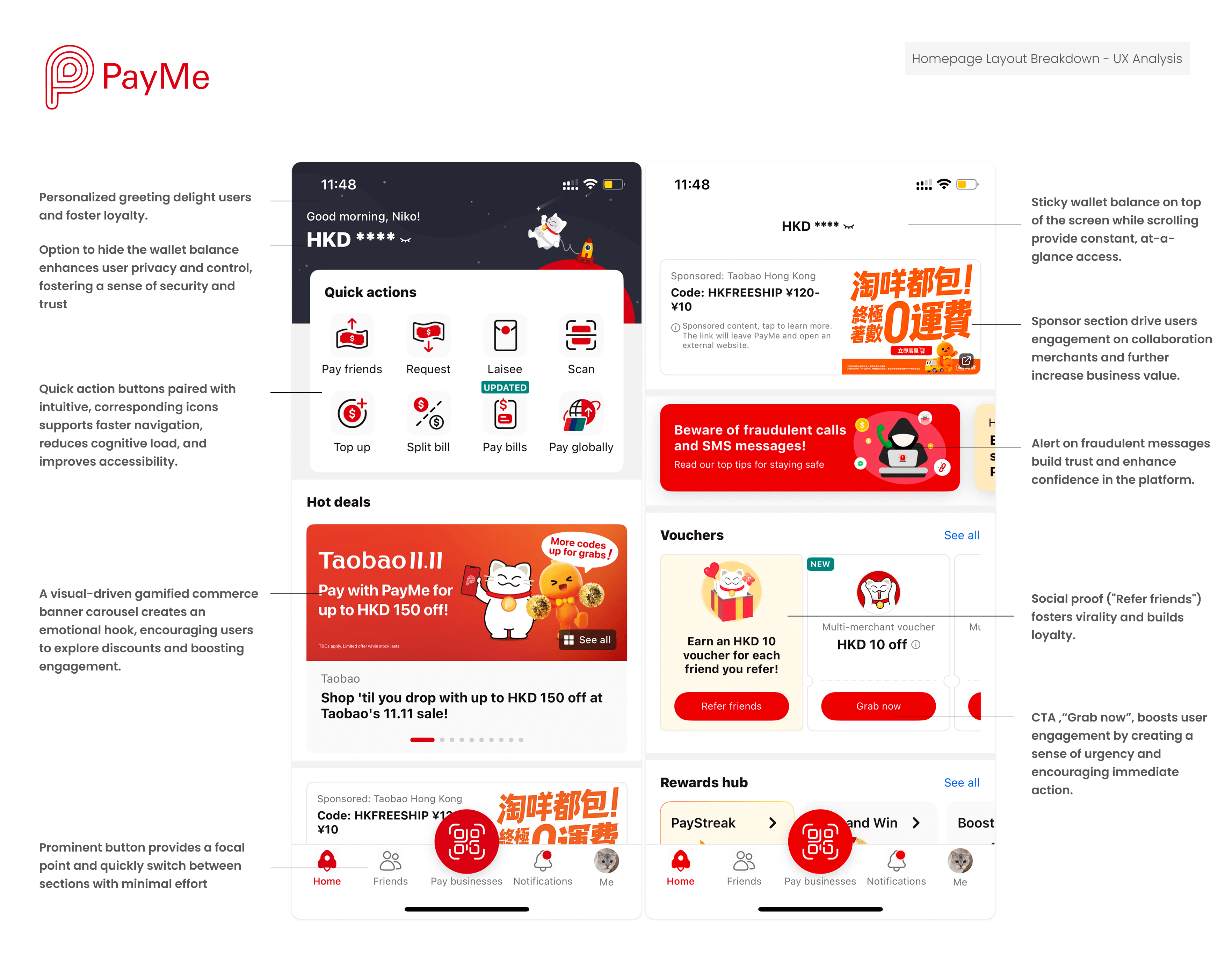
PayMe delivers a playful, gamified social commerce experience, blending vibrant, vertical-scrolling feeds with a distinctly Hong Kong-inspired aesthetic.
Through engaging micro-interactions and hyper-personalized features, PayMe fosters a sense of delight and community connection. By embedding personalization at its core, the platform transforms everyday transactions into dynamic, socially engaging experiences, driving deep user loyalty tailored to Hong Kong’s vibrant cultural pulse.
Key Takeaway
Minimalist layouts, like PayPal's, build trust and security for business payments—ideal for B2B scenarios where users prioritize reliability.
Vibrant, gamified designs, as in PayMe, drive engagement and loyalty—thriving in P2P or B2C platforms by turning everyday micropayments into social habits.
Ultimately, thoughtful UX/UI bridges user needs with growth levers! In HK's competitive fintech arena, these apps exemplify how design fuels scalability—PayPal via global depth, PayMe via local breadth.